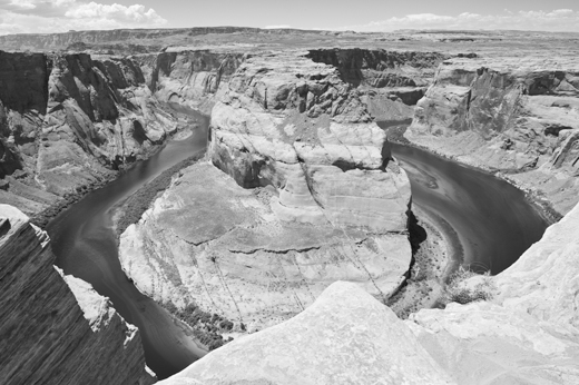
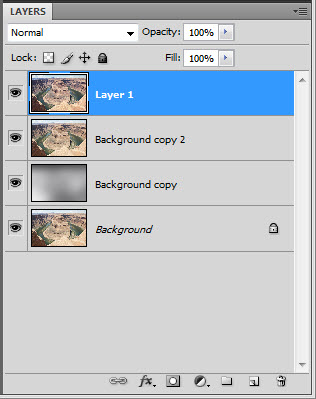
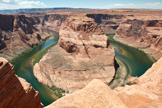
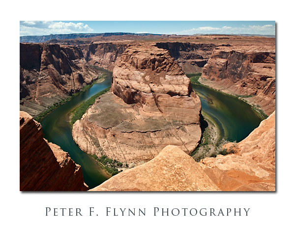
In Part II in the series we discussed an overlay method that improves definition in the highlight areas of the image. Part II was published on January 22, and Part I was published on January 13. In this installment, we will consider a method for enhancing contrast by application of a curves adjustment layer. Our working image is shown below.
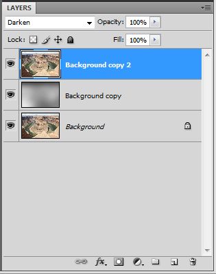
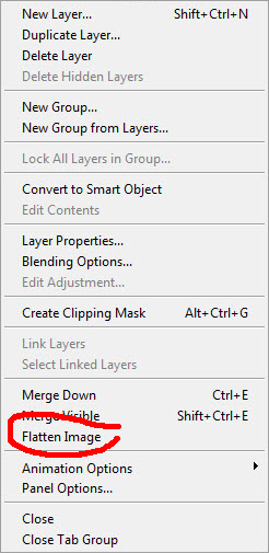
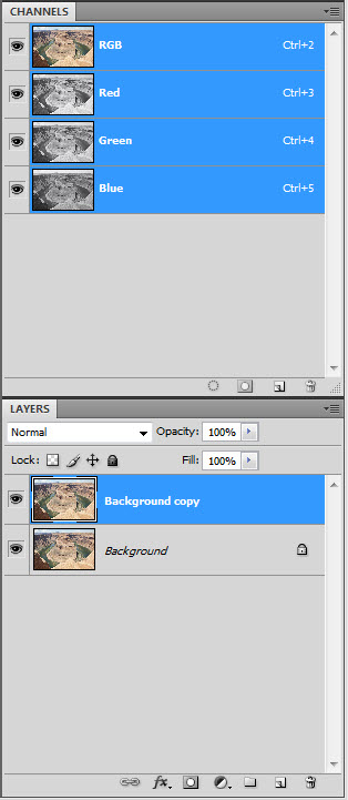
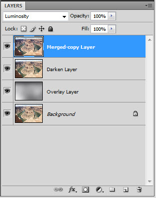
Currently, we have three layers: the top layer is a copy of the original unprocessed copy of the image in darken mode, a middle layer overlay layer, and the original image on the bottom. Let’s flatten the layer by opening the Layers submenu (click the downward point arrow in the upper right hand corner of the Layers tab) and selecting the Flatten option.
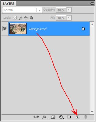
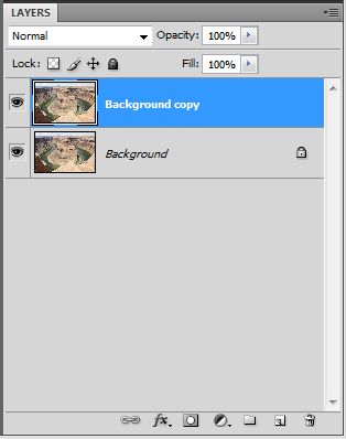
Then copy the resulting Background layer to generate a new Background copy layer.
A curious condition of RGB images is that the contribution of the red, green, and blue channels to the luminosity (contrast) present is not equal. We will leave a technical discussion for why this is so for a future entry, but in fact the green channel is most important, followed the red channel and then the blue channel in the ratio 6:3:1. This suggests that we could delete the blue channel and retain 90% of the current image contrast – it’s true!
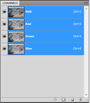
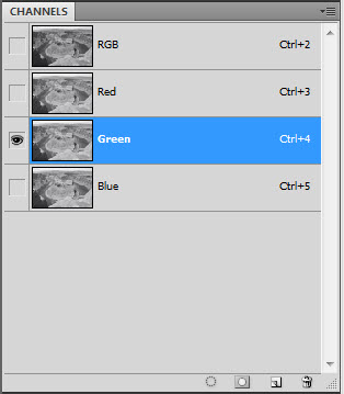
To review the contribution of the individual channels we open the Channels menu, select Window on the Photoshop top menu bar, and then select the Channels item from the drop down menu.
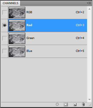
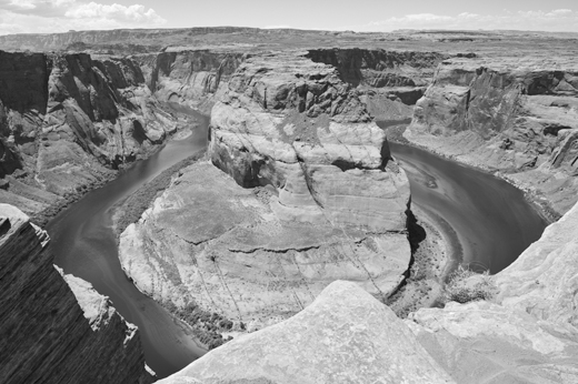
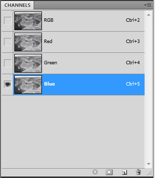
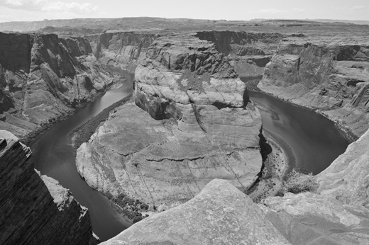
By selecting the individual Red, Green, and Blue channels in the CHANNELS tab in turn, we can see what each of these elements brings to the overall image – note that when a channel is selected, the channel indicator turns blue ( assuming default Photoshop behavior).
Select the red channel panel to activate only that channel.
Select the green channel panel to activate the green channel only.
Finally, select the blue channel panel to activate the blue channel.
Careful review of the individual channels confirms that they are all about equal in terms of providing elements of contrast to the image. This will not always be the case, especially in images recorded in red rock country. In this case, the most straightforward approach to improving contrast will be to apply curves adjustment to the individual red and green channels (the blue channel may be adjusted, but in practical terms, such adjustments have minimal impact).
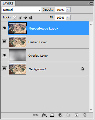
Begin by conducting a merge-copy by typing <cntl><shft>alt>e (<cmd><shft>alt>e on the Mac) This merges the current three layers into one layer, and then copies that layer on top of the others. We could have simply flatten the three layers and then copied the result, however the merge-copy gives us a bit of additional flexibility, e.g., we could always delete the merge-copy layer and then rework the darken or overlay layers.
So that we can remember how all the current layers were generated, let’s rename them by selecting (double-click) the text in the LAYERS tab.
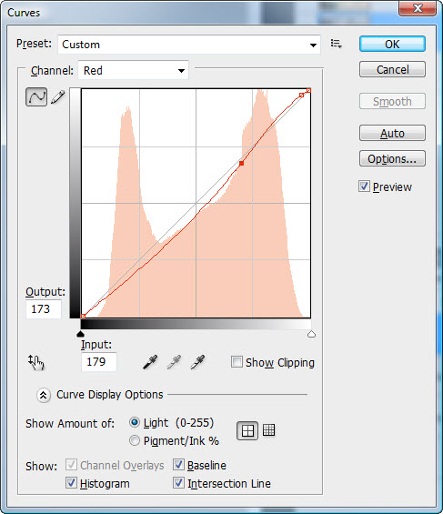
We now load the red channel by selecting that channel in the CHANNELS tab, and then apply a curve to the channel by typing <cntl>m (<cmd>m on the Mac).
Notice that I have steepened the curve near the maximum on the right hand side of the histogram (note that I have rendered the histogram so that it displays the amount of light – this is the default setting, however I usually rig it to show % pigment/ink). The right side of the histogram is where the luminosity of the lighter rock surfaces is represented, and steepening the curve in this region increases contrast in the rocks.
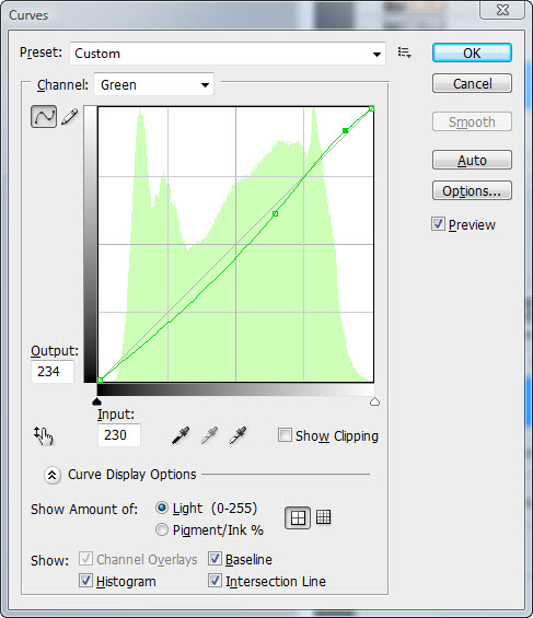
We apply a curves adjustment to the green channel to further enhance the contrast in the rocks.
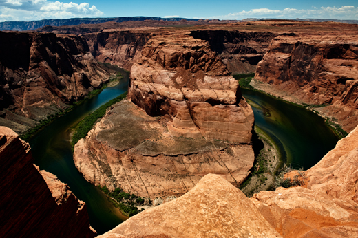
Since we are working in RGB color space, luminosity and color are intrinsically tied together. Thus the curves we have applied to the red and green channels generate not only a change in luminosity (contrast in the BW sense), but also a color shift. We can fix this easily by simply changing the blending mode of the Merged-copy Layer to luminosity to produce the contrast-enhanced (only) image shown below.
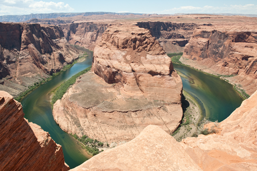
Compare this image (above) to the one we started with in this entry (below).
Next, we merge-copy to generate a new layer on top, and change the blending mode of the new layer to multiply.
Finally we adjust the opacity to until things agree with our vision of the place, about 60%, to finish up this lesson.
This was a long discussion, perhaps too long for most. Anyway, I hope you find it useful. Send questions if you got ’em. There is a quote by Edward Weston that I favor: “Photography to the amateur is recreation, to the professional it is work, and hard work too, no matter how pleasurable it may be”.
Copyright 2010 Peter F. Flynn. No usage permitted without prior written consent. All rights reserved.

